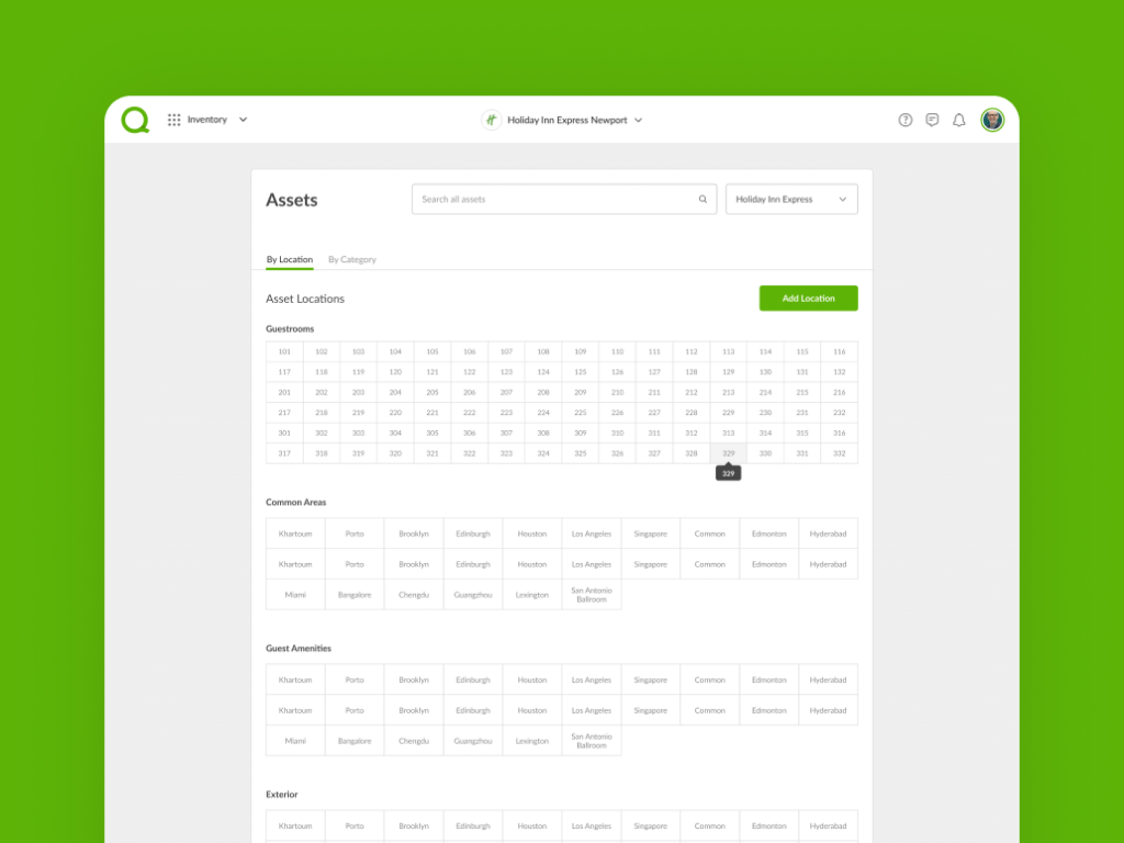
Bring order to chaos by giving the product team a guided and efficient way to build solutions, better align with engineering and reduce company costs.
Company
Quore Systems
Our biggest obstacle was designing around a large scale legacy system with a case of featuritis. We were also establishing foundational styling in tandem, so we had to be in constant communication to ensure those choices would cohesively scale across all components. Another challenge was using our design system to establish long-term value and a clear visual language. It was important we define components that were flexible and consistent across both web and native platforms. Communication and documentation were central in demonstrating the purpose behind our design decisions and creating future product solutions.
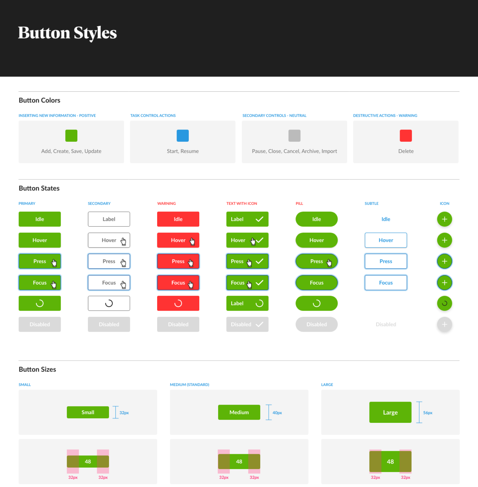
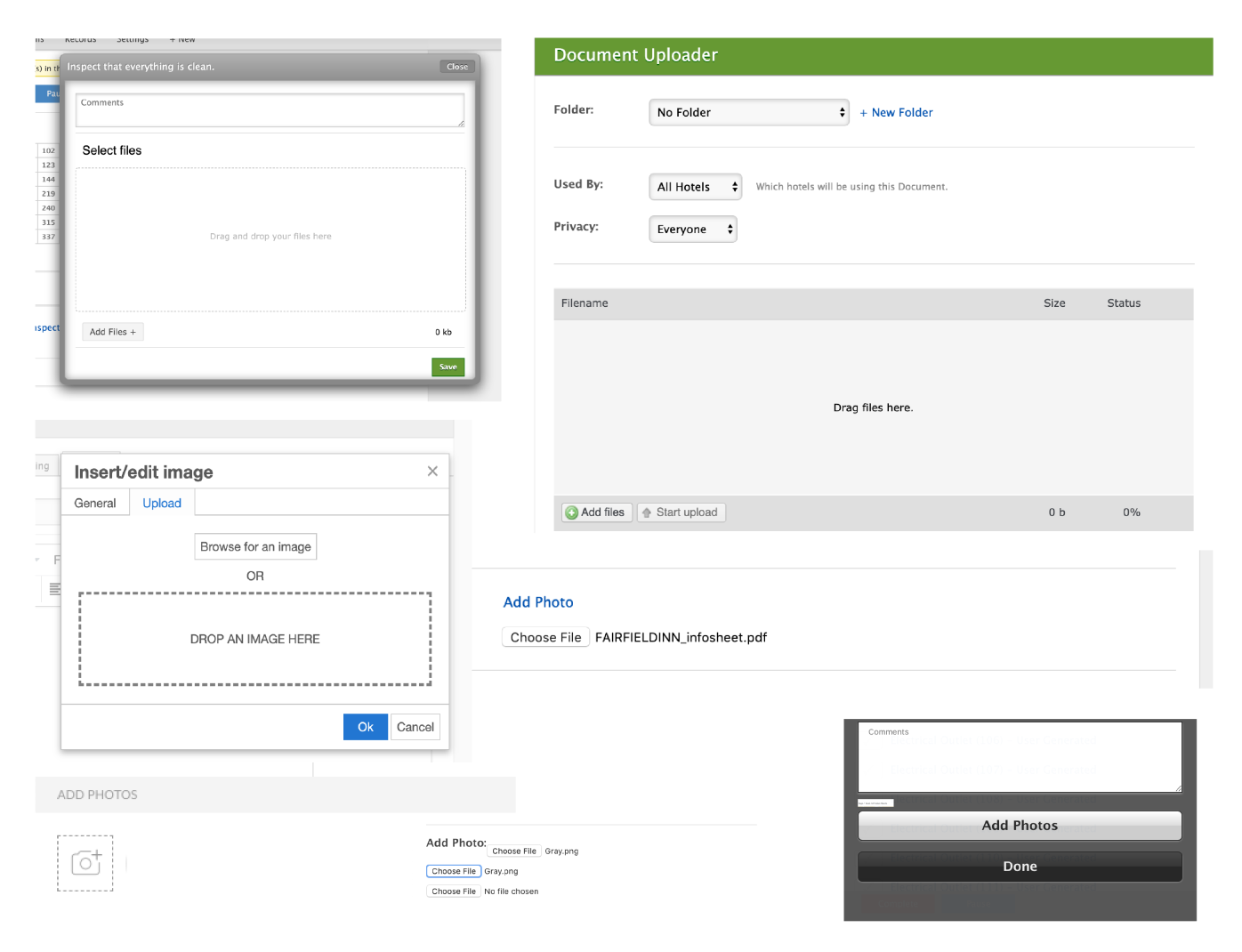
Figure 2: Phase I audit (file uploader mayhem)
Another challenge was using our design system to establish long-term value and a clear visual language. It was important we define components that were flexible and consistent across both web and native platforms. Communication and documentation were central in demonstrating the purpose behind our design decisions and creating future product solutions.
Figure 2: Phase I audit (file uploader mayhem)

Figure 2: Phase I audit (file uploader mayhem)
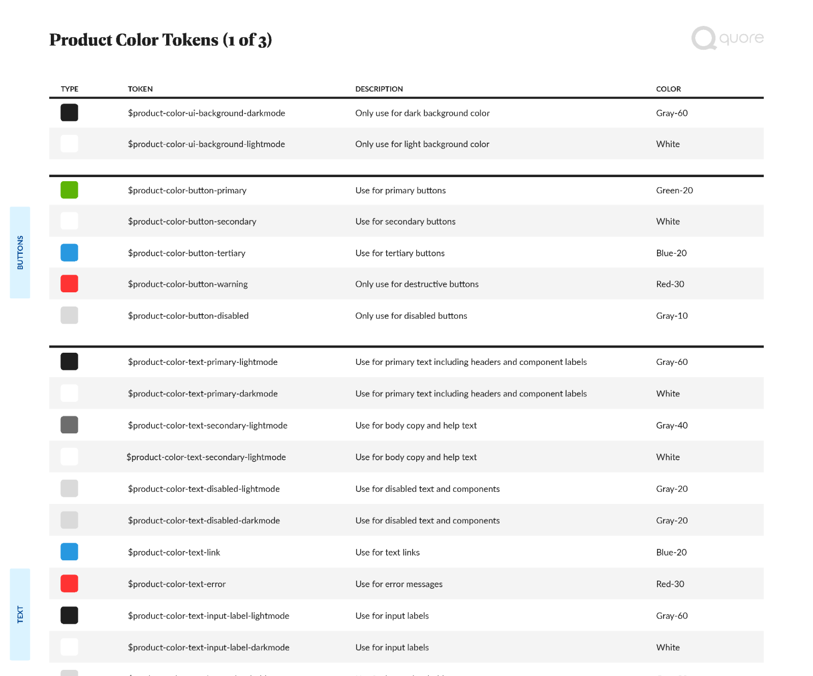
The first step involved auditing and identifying our components and patterns across desktop, mobile and native applications. This was a significant undertaking and a great team effort considering the breadth and depth of our product. Our team lead used this opportunity to redefine our foundational styles, which involved introducing a harmonious text style, expanding our color palette for accessibility and renaming our color scale so it was simpler to communicate (e.g. blue-60 vs midnight).
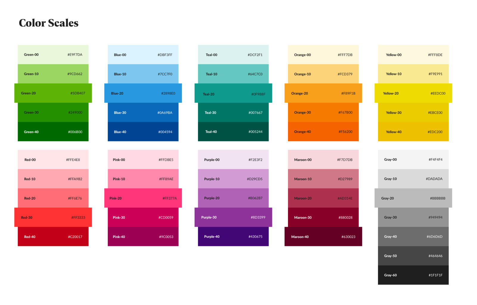
Figure 3: Phase I foundational styling

Figure 4: Phase II documentation
Redefining and rebuilding our design system has been a rewarding challenge and great team effort. We now have a selection of pattern libraries in Figma for foundational, desktop and native, which has allowed our small team to quickly assemble solutions. I have also been collaborating with our engineers to build a fully functional component library in Storybook. A design system is obviously never finished. Future ambitions include defining larger patterns and syncing design and engineering together so we can push style changes directly into production.
Figure 6: Design tokens