The emids Technologies website required a redesign to market their full line of IT services and thought leadership in healthcare. As the in-house designer, I collaborated with marketing leadership to deliver a fluid experience that put our customers first and catered information to their interest.


Their site required an expansion to encompass a healthcare IT service line that served multiple audience segments in the industry. They were also introducing a number of company focused additions including business processes and methodologies, so their “About” section need to be carefully thought out. A second requirement involved a focus on content marketing efforts so downloadable resources (i.e. white papers, case studies) and corporate blogging needed to be factored in. Overall, the site needed to be flexible and easily navigable in order to accommodate the complexity and abundance of content being introduced.
Their site required an expansion to encompass a healthcare IT service line that served multiple audience segments in the industry. They were also introducing a number of company focused additions including business processes and methodologies, so their “About” section need to be carefully thought out. A second requirement involved a focus on content marketing efforts so downloadable resources (i.e. white papers, case studies) and corporate blogging needed to be factored in. Overall, the site needed to be flexible and easily navigable in order to accommodate the complexity and abundance of content being introduced.
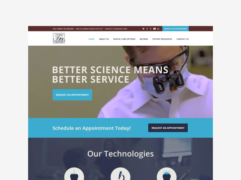
Site Architecture The first step was structuring a sitemap to offer an easily navigable framework with as few as clicks as possible. We structured the site by audience segments to help them easily identify their role and service interest. The “About” section was expanded to include three subsections. During the wireframe phase, we wanted to keep users engaged and enable them to cycle through relevant content so each subpage contained a sidebar that highlighted related services, insights, and downloadable resources. Due to the breadth of content, the “Insights” section was expanded to be a resource hub that included blog posts, videos, and white papers. This section included a clean, airy layout and presented the option to filter by category to easily locate information.

UI Design Considering the volume and depth of information I decided to keep the UI flat and clean with strategic use of white space and color to support the flow of content. Icons were also strategically used as visual indicators. I kept the style of the icons subtle and simple as I wanted them to be useful and not add visual noise. Mobile usability was driving factor behind my introduction of card-based design throughout. Card-based content is a clean, efficient way to provide glimpses of content and catalog information without overwhelming users. I also added color coding to make each section easily distinguishable.