Improve user experience for event management platform to help fundraisers reach more donors, easily manage their events and raise money for their cause
Company
Freelance Designer
Responsibilities

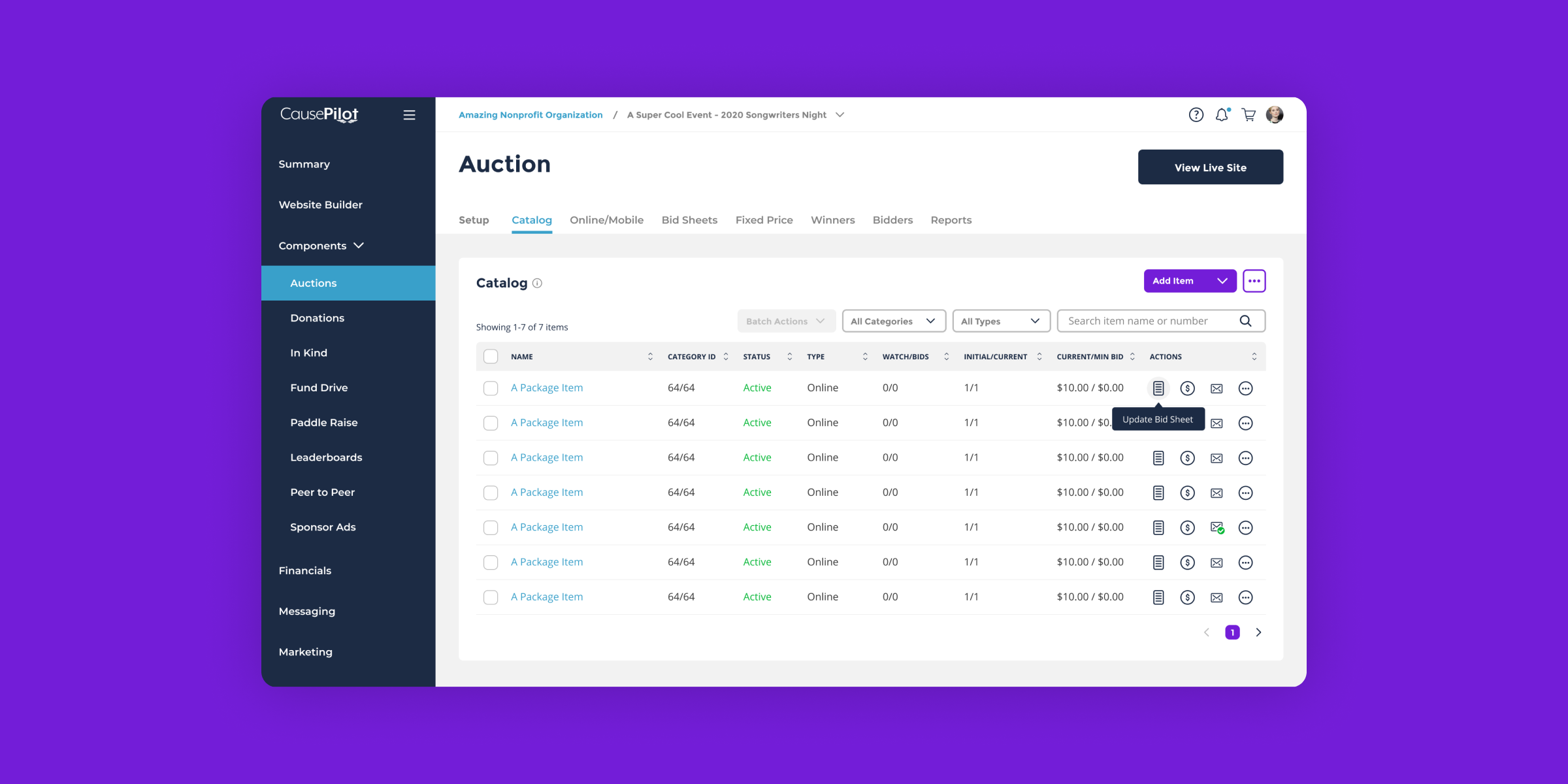
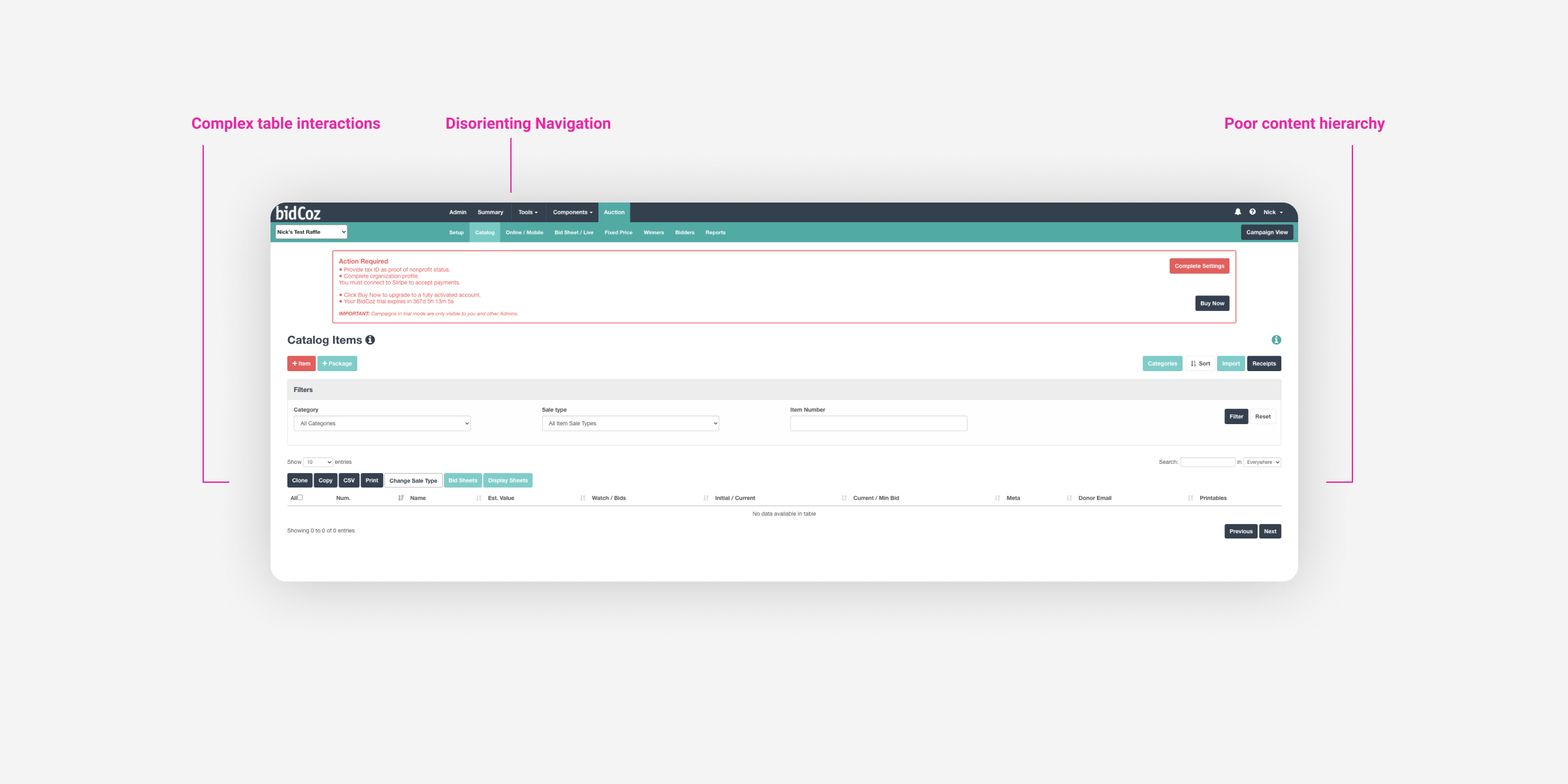
The existing software packed a lot of features to accommodate a variety of events for a range of roles including admins, campaign managers, fundraisers and supporters. The biggest pain point was usability. It was difficult to navigate and disorienting. Users were required to click around to discover pages and it was difficult for repeat users to find their way around. Pages also lacked content hierarchy and users were presented with an overwhelming amount of actions and options which depleted cognition and ease of use. The client wanted to redesign the existing software to be a trusted and friendly experience while retaining existing capabilities.
The existing software packed a lot of features to accommodate a variety of events for a range of roles including admins, campaign managers, fundraisers and supporters. The biggest pain point was usability. It was difficult to navigate and disorienting. Users were required to click around to discover pages and it was difficult for repeat users to find their way around. Pages also lacked content hierarchy and users were presented with an overwhelming amount of actions and options which depleted cognition and ease of use. The client wanted to redesign the existing software to be a trusted and friendly experience while retaining existing capabilities.
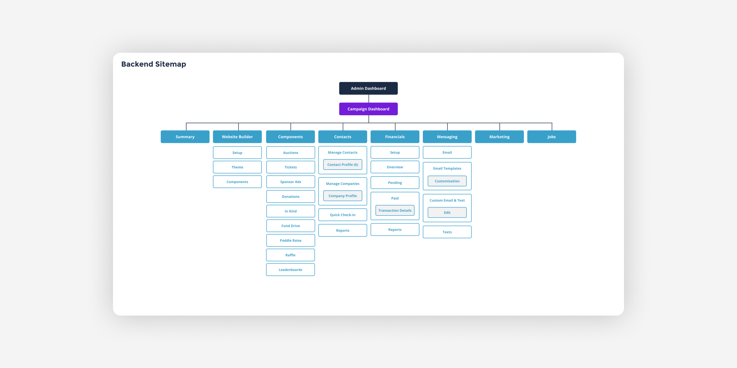
The client had a narrow budget and deadline, so I worked with them to better understand user needs and expectations. I then analyzed the content structure to understand the breath and depth and to see where we could simplify architecture.
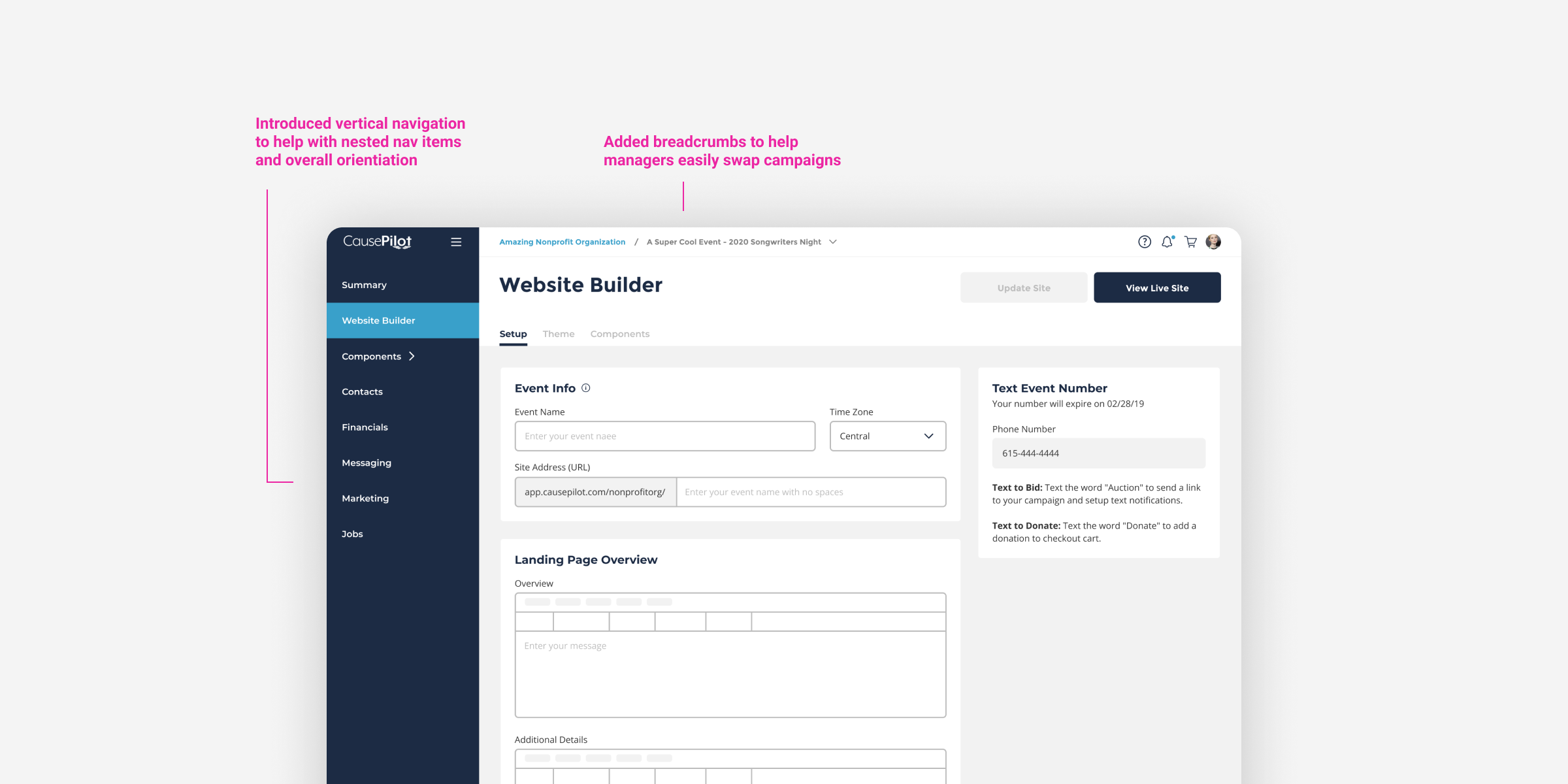
Navigation Solutions: I introduced a new vertical navigation bar to be mindful of scalability, make use of release estate and blend with secondary utility bar. Due to various user roles and product layers, I expanded the utility bar to include breadcrumbs to help with orientation. This was also flexible enough for admins to return to organization level and helped managers easily switch campaigns.
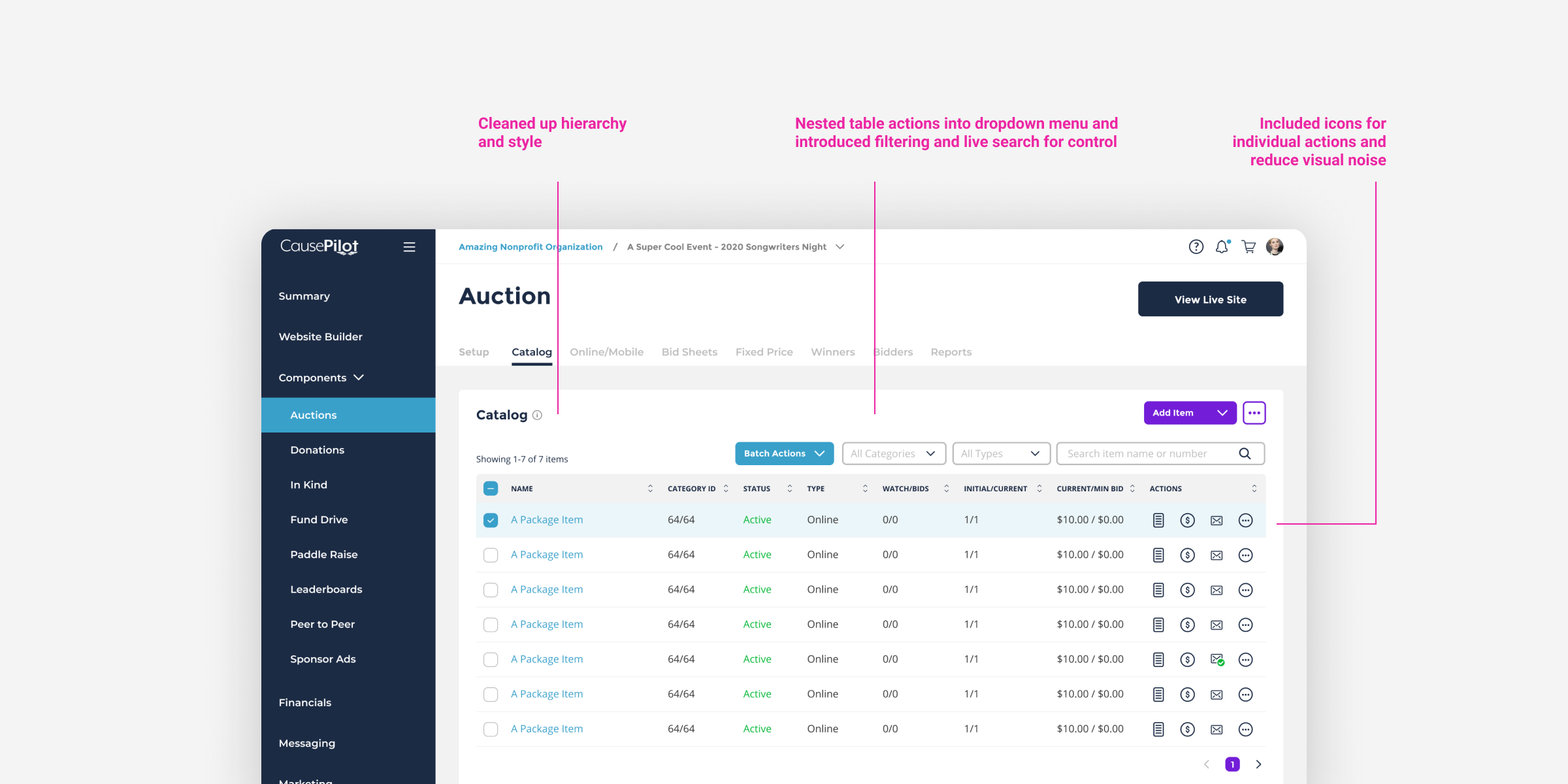

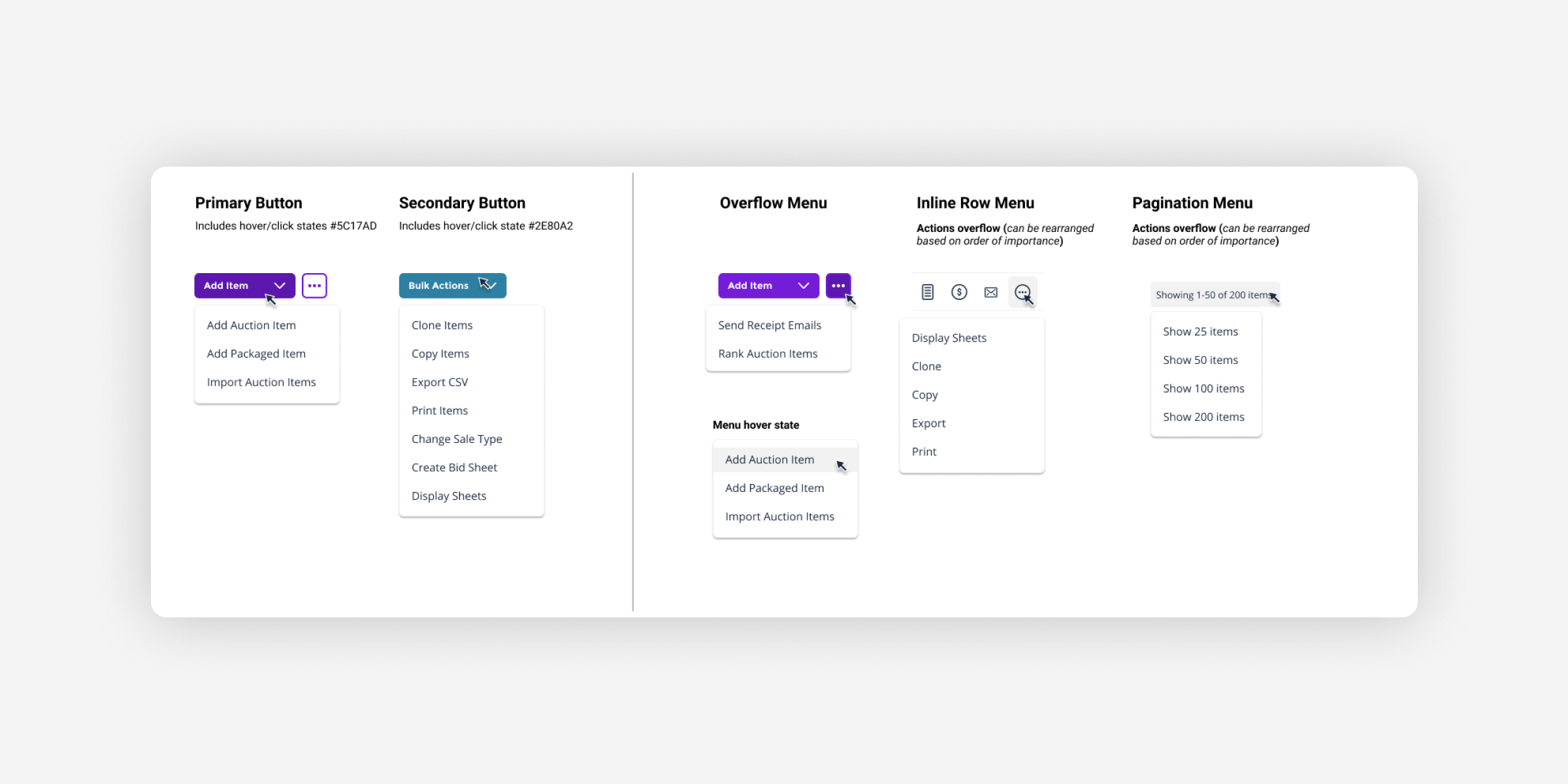
The client was pleased with the rearchitected solutions presented. The new UI components and patterns could be repurposed throughout the application allowing them to be self-sufficient with further redesigns and keeps their budget in scope. There’s also the ability to scale the product as they continue to grow. The enhanced experience helped eliminate inconsistencies and taxing navigation making it easier for customers to easily manage events and grow support for their cause.